US Wealth Management Firm · May 2023 - Jul 2026
Rebuilding the core workflow of a wealth management platform
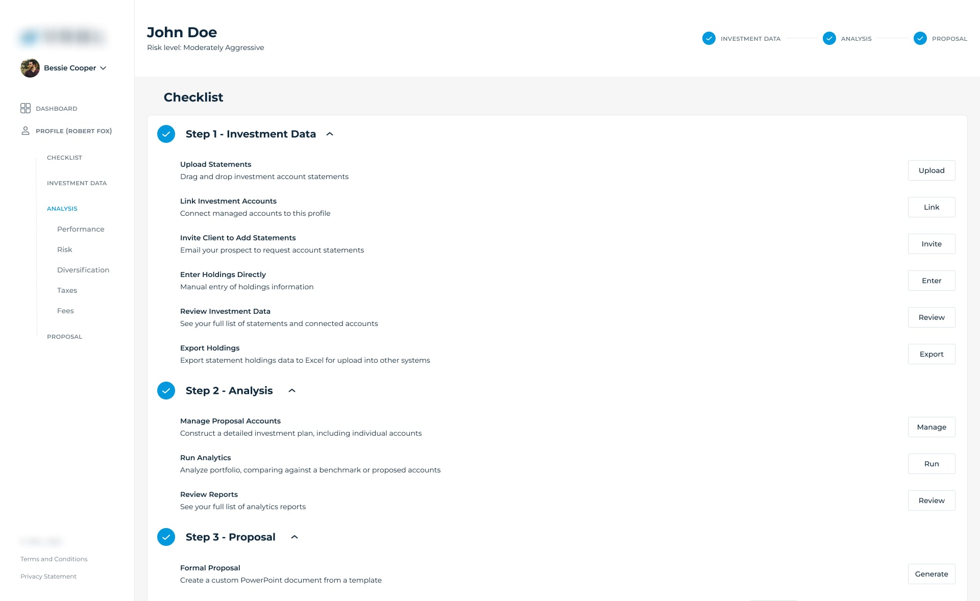
As lead product designer for over three years, I reworked the Checklist advisors relied on throughout every client profile - not a one-time setup step, but the hub they returned to again and again - then built out the design system, recommendation tools, and analytics dashboards on top of it.
This project is under NDA - the company name and product branding have been withheld, and all screens shown have had logos removed.
Team
Embedded design partner to the COO, CTO, and product managers
Scope
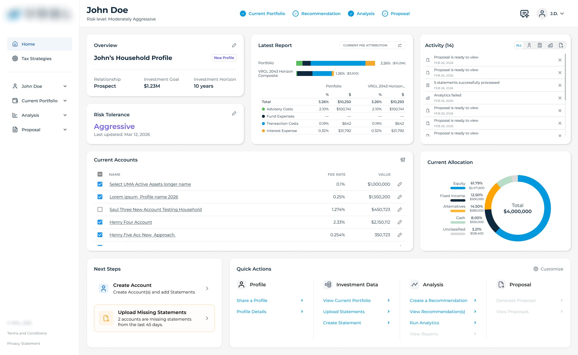
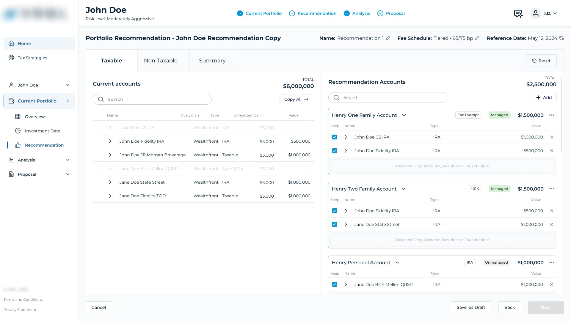
Checklist, design system, portfolio recommendations, analytics dashboards, reporting
Constraint
Every workflow had to stay accurate for regulated, real-money tax and portfolio calculations
Duration
May 2023 - Jul 2026, continuous iteration based on customer feedback
The problem
When I joined, at the center of that workflow was the Checklist - the hub advisors returned to again and again as they worked a client profile, not a one-time setup step. It was supposed to be the core of the app, but it wasn't working. It asked for too much at once, the process wasn't fluid, and advisors kept getting stuck on things like document processing and statement extraction every time they came back to it. There was also no design system to speak of - just a set of fonts and colors the client liked - so nothing about the interface stayed consistent as new features got added. Over the next three-plus years, working directly with large advisory firms serving high-net-worth clients, we rebuilt the Checklist experience from the ground up, then used that same foundation to build out the platform's recommendation tools, analytics dashboards, and reporting, tackling specific parts as customer feedback came in and new features got scoped.
Process
Reworked the Checklist from repeated advisor friction, not from a UI preference
The problem became clear through repeated feedback from advisory firms and the product team: advisors weren't moving through the Checklist once and leaving it behind. They were returning to it throughout the client lifecycle, often after documents had been uploaded, processed or changed.
That meant the original model was wrong. We were treating the Checklist like a setup flow when advisors were actually using it as an ongoing workspace.
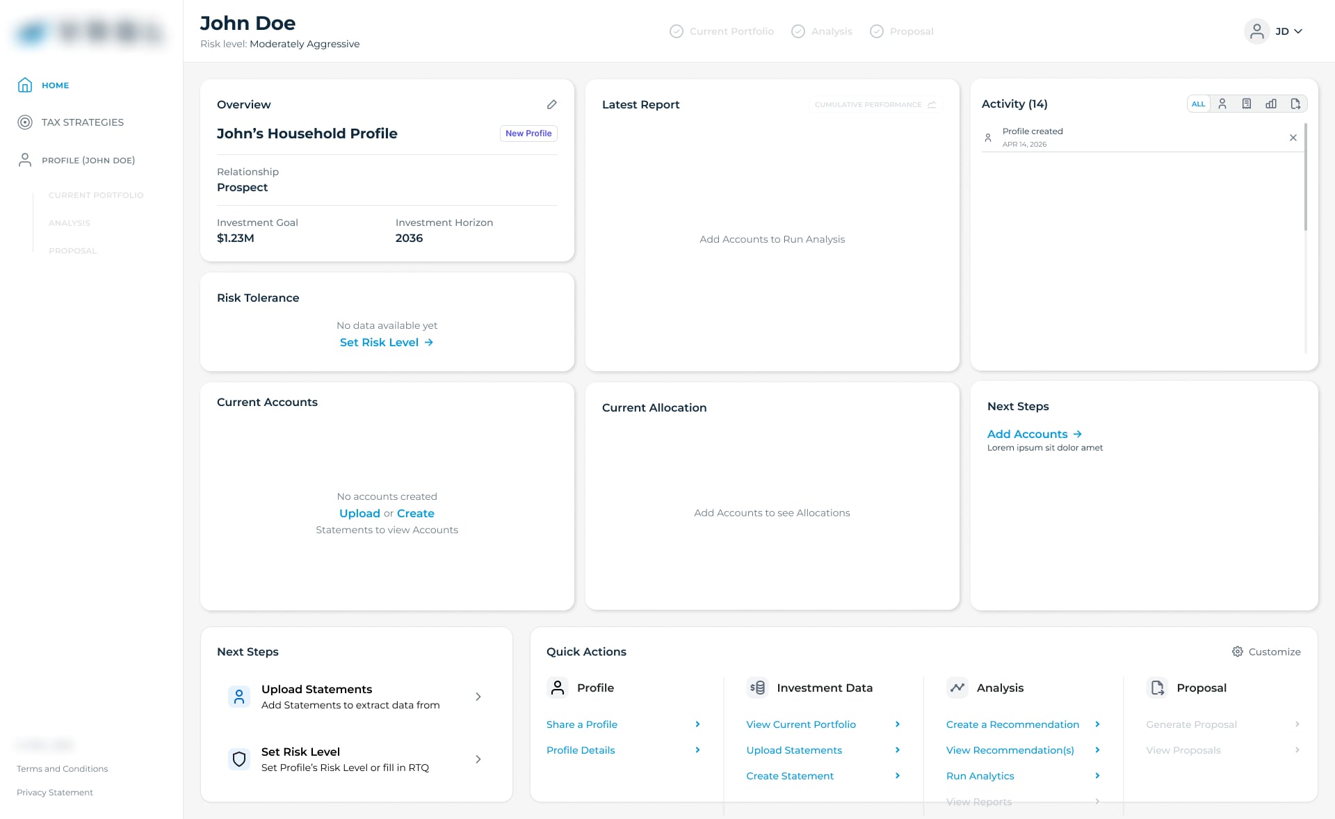
I mapped where people were getting blocked, particularly around document processing and statement extraction, and redesigned the experience around smaller contextual actions. Instead of sending advisors back to one dense page, the relevant next step could appear where they were already working.
The important decision wasn't making the Checklist visually simpler. It was changing the underlying interaction model once the way advisors actually used the product became clear.
Built the platform's first design system, then made it legible to AI agents
There was no design system when I started - just a set of fonts and colors the client liked. I built a full Figma system covering typography, color, tokens, spacing, and a component and icon library, then wrote a Design.md file distilling it into something AI coding agents could reference directly, since AI-assisted development was already becoming part of how the team shipped.
Used AI to prototype faster across every new feature, not just the big ones
I used to build Figma prototypes the old way, wiring up interactive components and variants by hand. Once tools like Figma Make, Replit, and Lovable became part of my process, prototyping got roughly ten times faster - which meant more directions in front of stakeholders before committing to one, instead of betting early on a single approach.
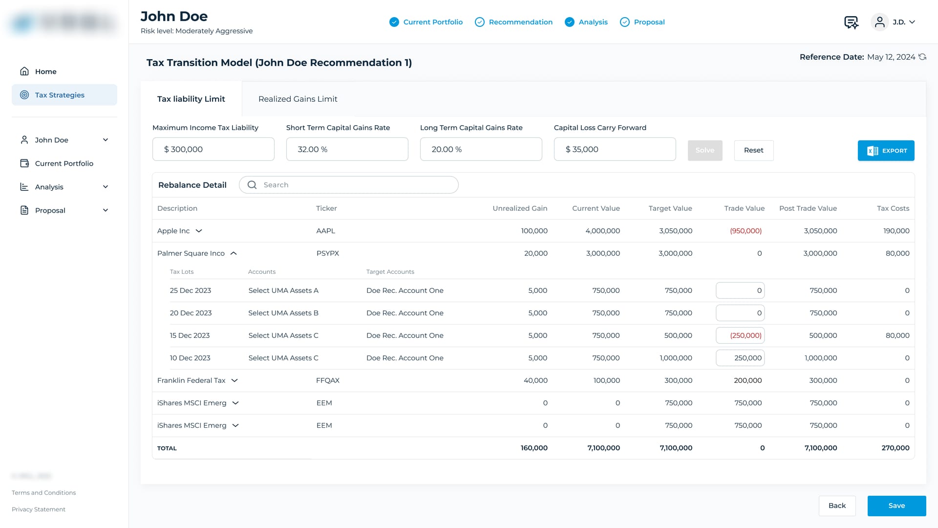
Selected screens
Key decisions
Reframed the Checklist as an ongoing workspace, not a setup gate
Early on, the Checklist was treated more like a setup step before advisors moved into the rest of the product. But repeated customer feedback and usage patterns showed something different: advisors kept returning to it throughout the client lifecycle.
I used that evidence to reframe the Checklist as an ongoing workspace rather than a gate. Aligning on that model with the COO, CTO and product team became an important foundation for the contextual next-step system and much of the work that followed.
Kept dashboard customization focused on common advisor needs
We explored giving advisors freely resizable and overlapping dashboard widgets. The flexibility was attractive, but it also created problems with hierarchy, consistency and the amount of setup required before the dashboard became useful.
I recommended a more structured layout that worked well by default while still allowing the product to evolve around the information advisors actually needed most often.
Outcome
Contextual, not dense
the Checklist redesigned around small, always-forward steps advisors could pick up anytime, instead of one dense page
Design system, from zero
full Figma system - typography, tokens, components, icons - plus a Design.md spec for AI agents
Faster design exploration
AI-assisted prototyping reduced the time needed to turn ideas into interactive concepts, allowing more directions to be explored with stakeholders before committing to implementation
Described qualitatively - exact adoption and efficiency figures weren't tracked in a form precise enough to cite here.
What I’d do differently
The biggest lesson from working on the same product for more than three years was how much leverage sits in the underlying product model.
Once we understood that the Checklist was something advisors returned to throughout the client lifecycle, rather than a one-time setup flow, many downstream decisions became easier.
If I started the project again, I would spend more time early on mapping those repeated behaviours and identifying structural assumptions like that before getting too deep into individual features.