IAEA (International Atomic Energy Agency) · Sep 2022 - Apr 2023 · 8 months
Designing the analytics platform behind global nuclear safeguards verification
As lead UX/UI designer, I designed the IAEA's sample evaluation platform end-to-end - dashboards and data tracking, a query builder and plotting toolkit for deep analysis, and a portable field app for collecting samples - replacing a decades-old, spreadsheet-style interface, almost entirely without direct access to real users or real data.
Team
Me, our project manager (the only one cleared for IAEA HQ access), and developers
Scope
Dashboards & data tracking, a data constructor with query builder and plotting, and N Portal, a portable field app
Constraint
No direct access to SMEs or real data - requirements came through our PM
Duration
8 months, Sep 2022 - Apr 2023
The problem
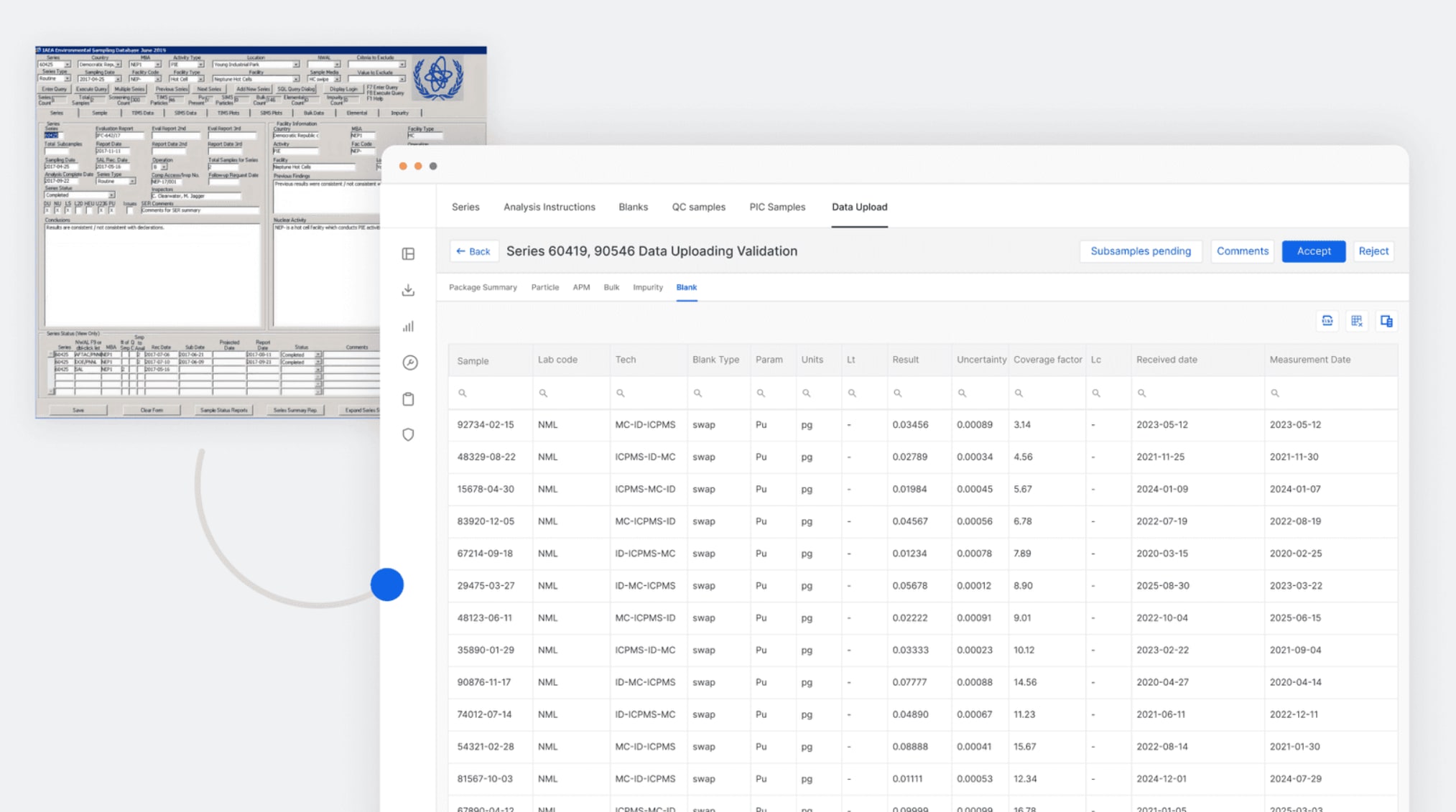
Before this project, the platform looked like software from the 1990s - dense grids of cells and numbers, no real visualization, and none of the capability scientists actually needed: no query builder, no plotting tools, no way to bring samples collected in the field into the system directly. This platform is used to detect and locate microscopic nuclear particles in environmental swipe samples, verifying state compliance with non-proliferation treaties - work with real geopolitical weight if a result gets missed or misread. I designed the replacement from the ground up. The added constraint: this was sensitive enough that I never had direct access to the scientists who'd use it, or to real sample data.
Process
Modernized dashboards and data tracking before touching the specialized tools
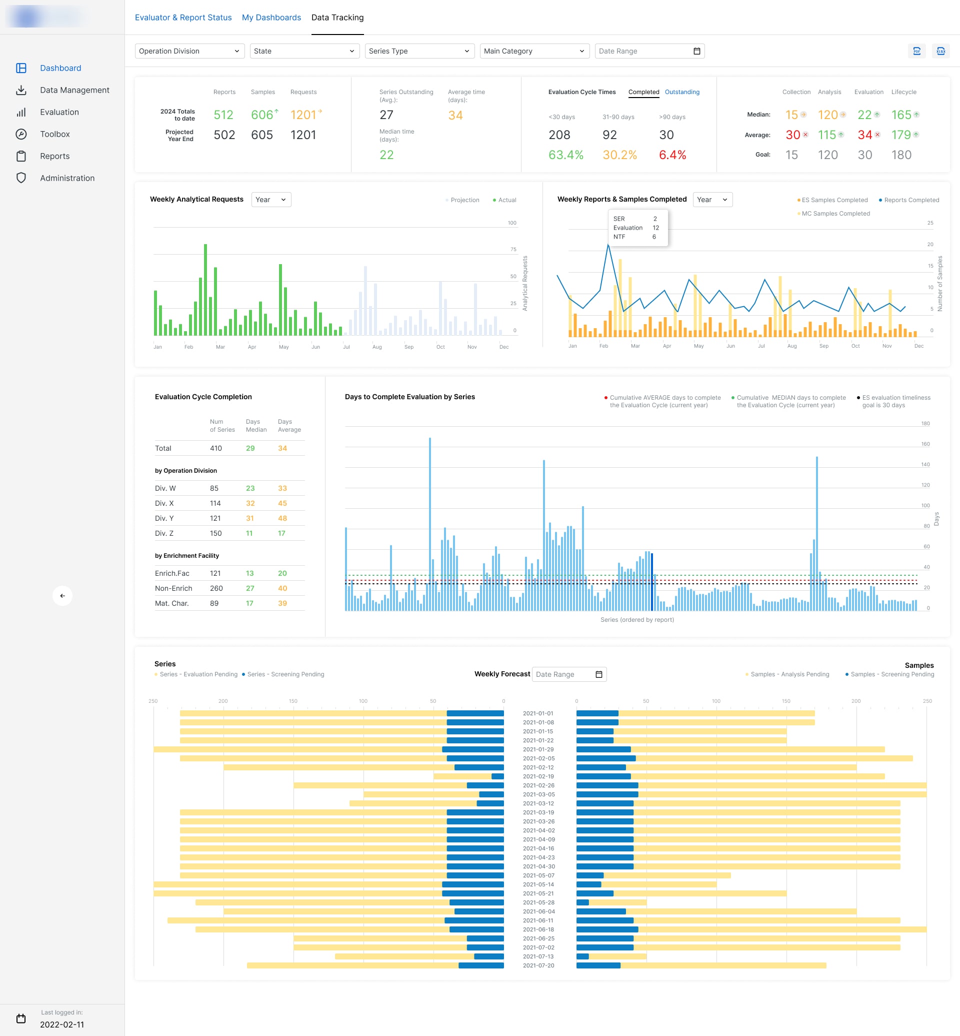
The existing system looked like it hadn't changed since the 90s - dense cells and numbers, no visualization. I started with the dashboards and data tracking screens scientists used most often, since that's where the daily value was, before moving on to the more specialized, lower-frequency tools.
Built the data constructor, query builder, and plotting tools from nothing
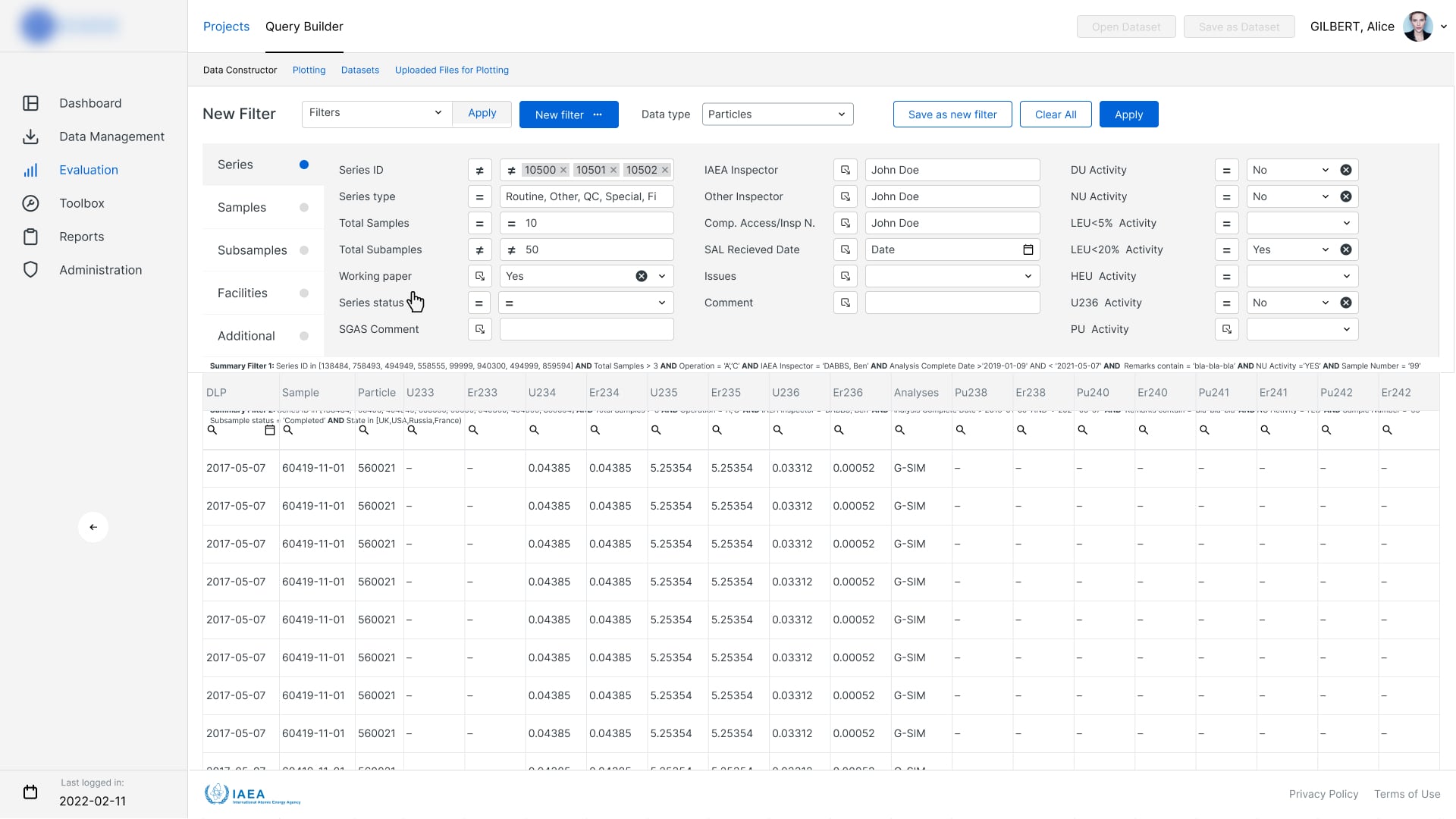
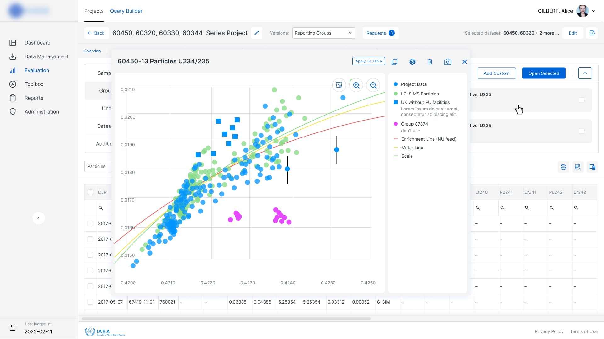
None of this existed before: a way to construct custom data views, query the underlying sample data directly, or plot results for analysis - including SEM (Scanning Electron Microscopy) data used for particle screening, morphological and elemental analysis, and selecting targets for secondary analysis. I designed these as one connected set - build a query, see it as data, see it as a plot - instead of three disconnected tools bolted together.
Designed N Portal as a portable, field-ready app, not a shrunk desktop screen
N Portal needed to work for someone adding samples on-site, not at a desk. I designed it as its own portable experience built around the actual field-collection workflow, instead of just squeezing the desktop data-entry screens onto a smaller device.
Selected screens
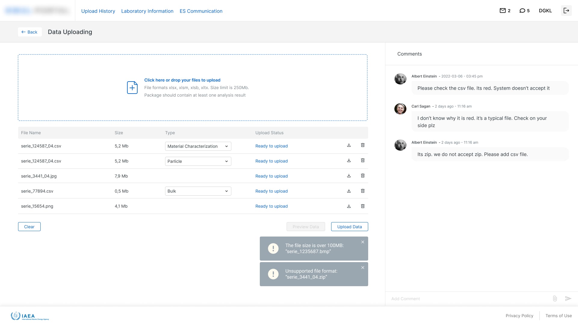
Key decisions
Designed for cross-functional context in a dense, specialized interface
Analysts needed to see how a result connected to related samples, prior findings, and reference data - not just the one record in front of them. I designed the review and analysis screens to surface that context directly, instead of leaving analysts to hold it all in their head across separate screens.
Automated the handoffs instead of just digitizing them
Much of the old process was slow not because individual steps were hard, but because handing data from one stage to the next was manual and insecure. I designed the workflow to move data between stages automatically and securely, instead of just putting a nicer interface on the same manual handoffs.
Outcome
1 Integrated Platform
consolidated previously fragmented scientific workflows
489 Product Screens
designed across desktop, analytical, reporting, and field workflows
Full Workflow Traceability
maintained auditability across data collection, analysis, and reporting
Figures are drawn from a public case study Rokolabs (the agency I worked through on this engagement) has since published.
What I’d do differently
The biggest limitation of this project was also the one I had the least control over: I couldn't speak directly with the scientists using the system or work with real production data.
Our project manager had regular access to the IAEA team and became the bridge between their domain knowledge and our product decisions. I learned to make that relationship much more structured: document assumptions, identify what had been confirmed by specialists, and separate it from what we were still inferring as a product team.
If I had direct user access, I would add observation and usability testing around the most specialised workflows, particularly the Query Builder, plotting tools and field collection experience. Those are exactly the areas where seeing how scientists work would give you information that requirements alone can't.