Energy Field Monitoring Platform · Dec 2022 - Aug 2023 · 8 months
Redesigning a data-heavy fluid monitoring platform for mobile
As product designer, I led the mobile redesign of a real-time fluid monitoring platform for oil & gas operations - simplifying data-heavy desktop screens, thick with filters and options, into a focused experience engineers could actually use on the pad.
The company name has been withheld here; the rest of the project details are accurate.
Team
Stakeholders, engineers, and product teams
Scope
Mobile UX and UI for a data-heavy, real-time fluid monitoring platform
Constraint
Design work was software-only, consuming live sensor data from the field
Duration
8 months, Dec 2022 - Aug 2023, continuous
The problem
The platform already existed as a data-heavy desktop tool - dense screens packed with filters and monitoring options for tracking real-time fluid chemistry, slurry quality, and rheology on the pad, the kind of automated, continuous monitoring that replaced manual, irregular lab sampling. The real problem was that it had no mobile version, even though the people who needed it most - engineers and operators working on-site - weren't sitting at a desk. I led the design of a mobile experience that had to carry the same real-time monitoring value without simply cramming the desktop layout onto a smaller screen.
Process
Started from what the desktop screens actually asked people to track
The existing desktop experience packed real-time fluid chemistry, slurry quality, and rheology monitoring into dense screens full of filters and options. Before designing anything for mobile, I mapped what of that people actually needed in the field versus what only made sense at a desk.
Designed mobile as its own experience, not a shrunk desktop layout
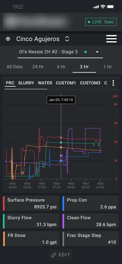
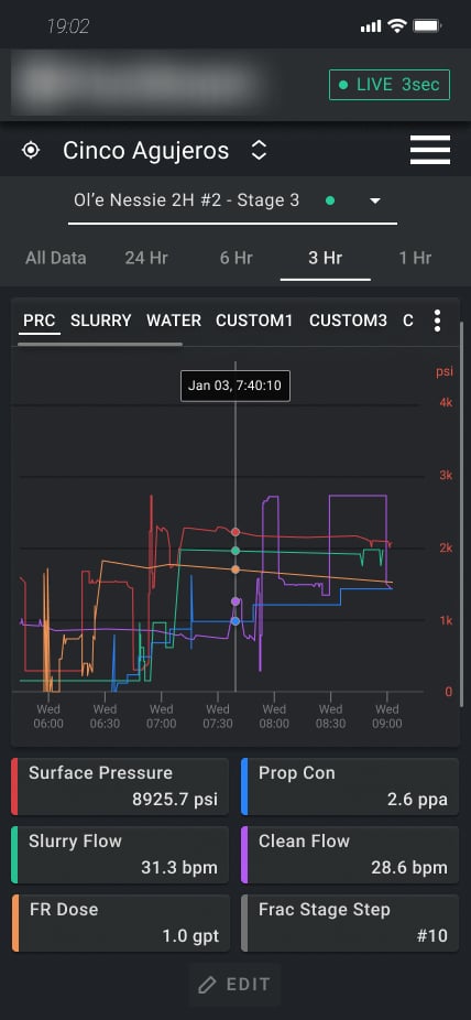
The mobile UI had to carry the same real-time monitoring value in a completely different context - someone standing on the pad, not sitting at a workstation. I designed the information hierarchy from scratch around that, instead of trying to fit the desktop's dense layout onto a smaller screen.
Designed and shipped 100+ mobile screens across the platform
This wasn't one or two adapted views - it was the full set of monitoring and workflow surfaces, redesigned for mobile end to end. Keeping the information hierarchy consistent across that many screens mattered as much as getting any individual one right.
Selected screens
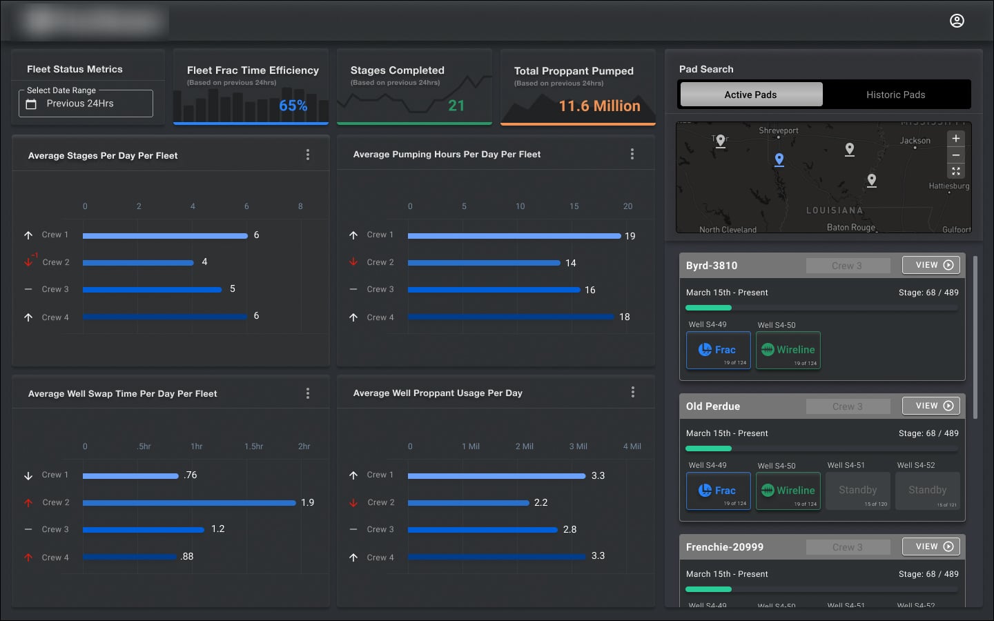
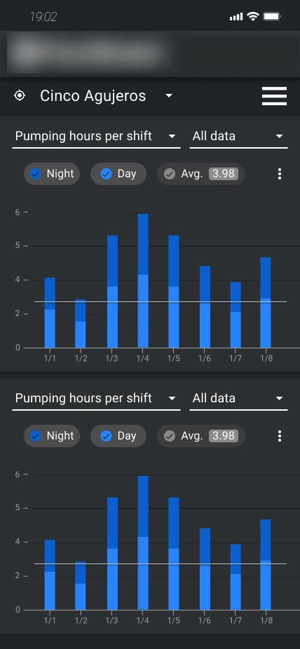
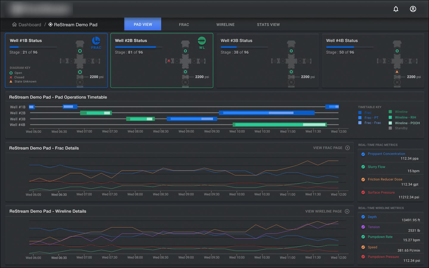
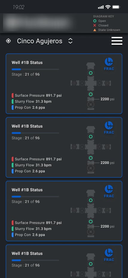
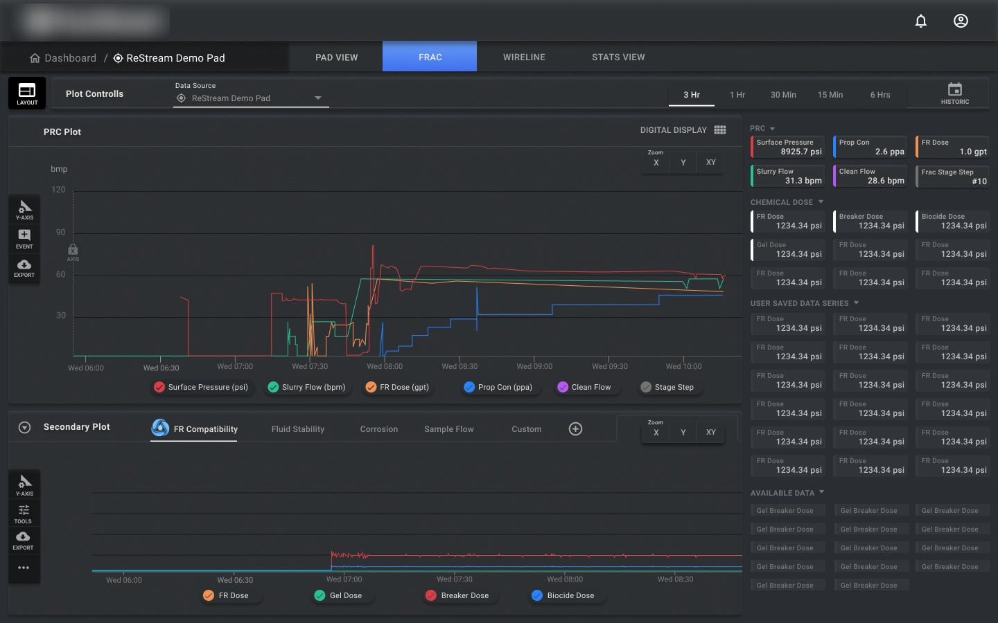
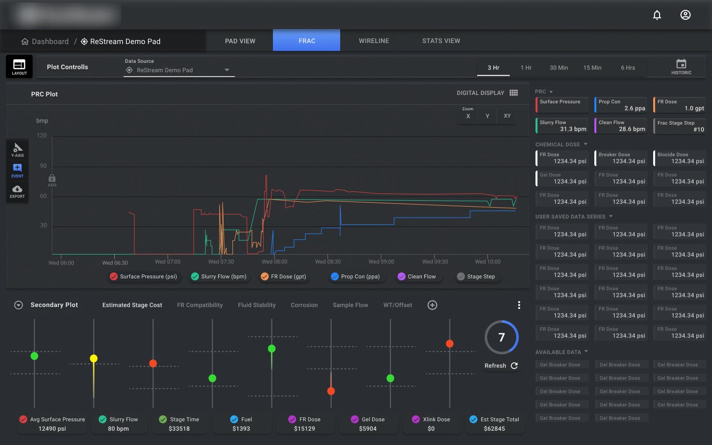
Key decisions
Pushed back on 'show everything, just let people scroll'
The client wanted every option and filter visible on mobile, just stacked and scrollable, matching the desktop experience one-to-one. I argued that was the wrong tradeoff on a small, data-heavy screen - I designed the primary monitoring data to stay visible by default, with secondary options tucked under a 'more' control, and made the case that a deliberate hierarchy would beat an undifferentiated scroll. It held up.
Kept the core real-time monitoring value non-negotiable
Whatever else got simplified for mobile, the continuous, automated fluid chemistry and slurry monitoring - the thing replacing manual lab sampling - couldn't become secondary or something users had to dig for. I made sure it stayed the default view, not a feature buried under navigation.
Outcome
100+ screens
designed for the mobile experience across the platform's monitoring and workflow surfaces
80% less time
spent managing data, after moving from the dense desktop-only experience to a focused mobile one
Up to 46%
savings on chemical cost, driven by faster, more accessible real-time monitoring in the field
Outcomes as reported by the client following the mobile rollout.
What I’d do differently
“The client's instinct - keep everything visible, just let people scroll - is a completely reasonable-sounding default, and I still think it would have been the wrong call. Data-heavy doesn't have to mean everything-at-once; it means being deliberate about what's default and what's one tap away. Getting that trusted enough to ship was more valuable than any individual screen design, and it's the part of this project I'd point to first.”