Life Sciences Project Platform · Apr 2025 - Aug 2025 · 5 months
Designing project tracking for drug development teams
As product designer, I built the dashboards and project management tools that let life sciences teams track complex drug development projects - milestones, timelines, and operational progress - in one place.
The company name has been withheld here; the rest of the project details are accurate.
Team
Stakeholders and product teams
Scope
Project dashboards, kanban boards, timelines, milestone tracking
Constraint
Programs ran across dependent phases, scientific milestones, and shifting timelines
Duration
5 months, Apr 2025 - Aug 2025
The problem
This was a new platform, built from scratch, for tracking drug-development and release programs - not a generic project management tool with a life sciences skin on it. The thing that made it genuinely harder than a typical PM tool: a project here wasn't a collection of tasks with owners and due dates, it was a drug-development program made of highly dependent phases, scientific milestones, specialist teams, and timelines that kept shifting. Representing that clearly enough that teams could see real project health at a glance, without flattening the complexity that actually mattered, was the core design problem for the full five months.
Process
Designed project health as the front door, not a buried report
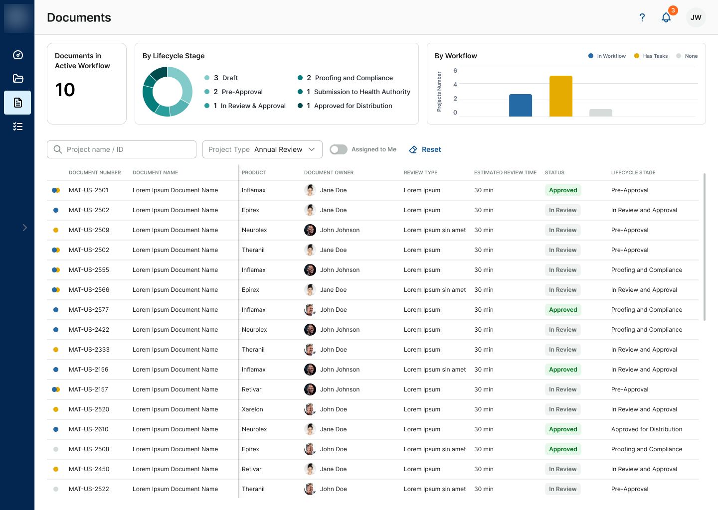
Teams needed to know how a project was doing before they needed any specific detail. I built the dashboard experience around project health, progress, and priorities as the first thing visible, with kanban boards and detailed timelines available as the next layer down.
Modeled phases as a first-class structure, not a status field
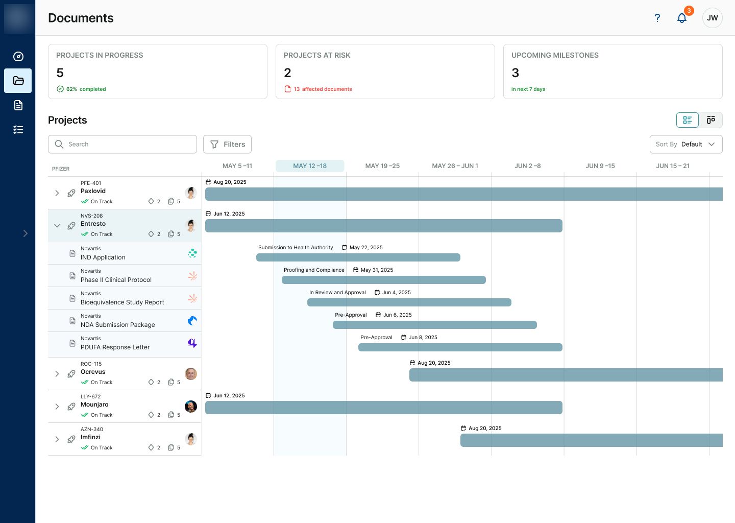
Drug development moves through distinct phases with real gates between them, not just a linear progress bar. I designed the timeline and milestone views around that phase structure directly, so a project's actual position in its lifecycle was always visible, not inferred from a percentage.
Simplified without hiding the complexity that mattered
It would have been easy to flatten these projects into a generic task list. I worked to keep the structure life sciences teams actually relied on - phases, milestones, dependencies - visible and scannable, instead of trading it away for a simpler-looking but less useful view.
Selected screens
Key decisions
Landed on the timeline, not kanban, as the primary view
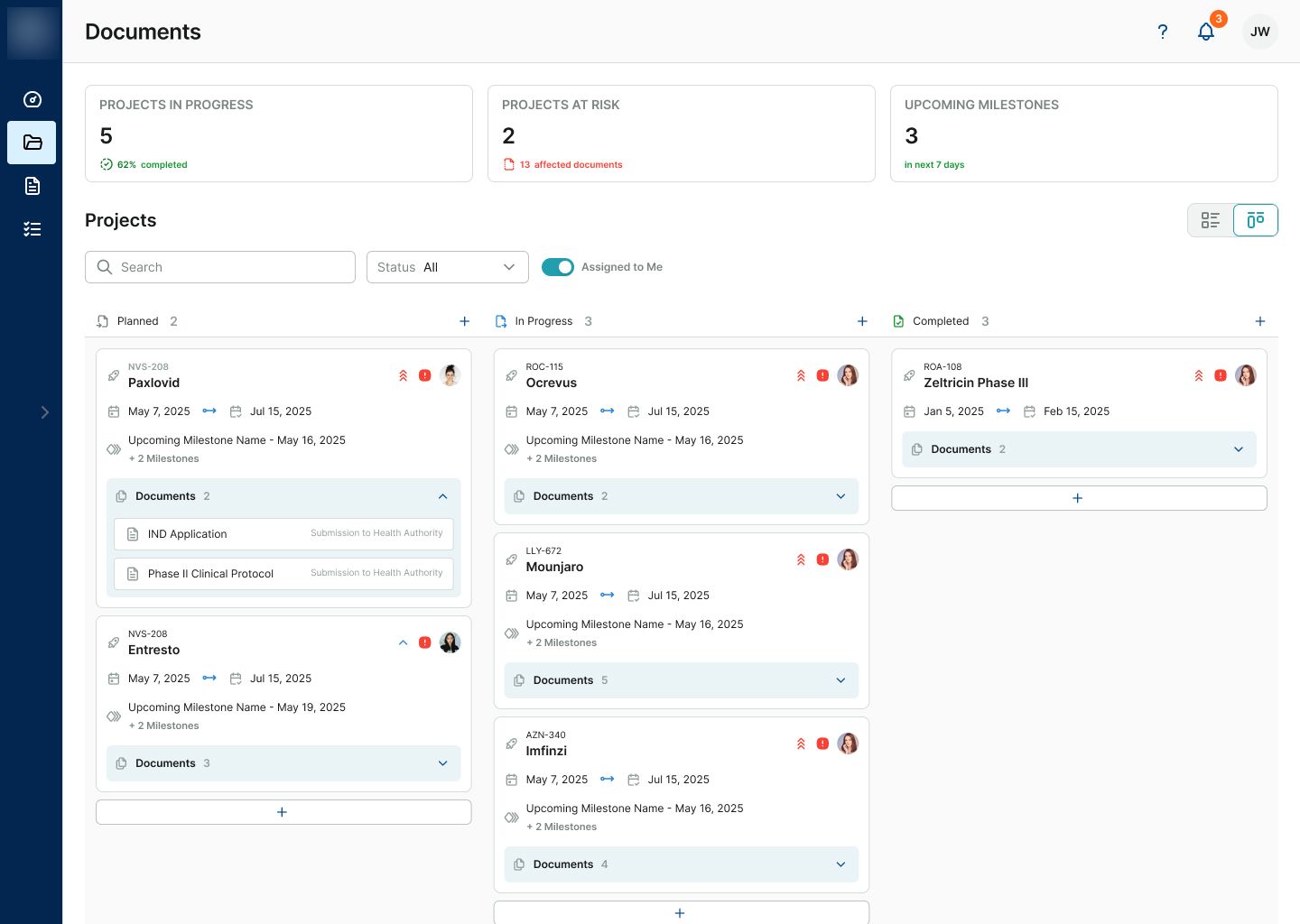
The initial direction was to make kanban the primary view. I mapped both kanban and timeline models against the questions teams actually needed to answer: what is in progress, which phase are we in, what depends on what, which milestones are approaching, and are we still on track.
Kanban worked well for current work state, but the timeline made phase gates, dependencies, target dates and parallel workstreams visible together. Based on that comparison, we aligned on the timeline as the primary program view while keeping kanban available for work-state tracking.
I elaborated that kanban answers 'what is everyone working on right now,' but a multi-year drug-development program needs to answer 'where is this program, what depends on what, and are we still on track' - a different question kanban isn't built to show. Testing both models against the actual program structure made the trade-off clear, and we aligned on the horizontal timeline as the primary view with phases, milestones, dependencies, target dates, and parallel workstreams all visible together - with kanban still available, just not the front door.
Kept status indicators consistent across every view
With dashboards, kanban boards, and timelines all showing overlapping project data, I standardized status indicators and color meaning across every surface, so a team member didn't have to re-learn what 'at risk' looked like depending on which screen they were on.
Outcome
Timeline over kanban
aligned on a phase-and-dependency timeline as the primary view, after testing it against the client's initial kanban-first preference
One project-health view
consistent status indicators across dashboards, kanban boards, and timelines
Built from zero
a new platform designed from scratch around real drug-development phases, not adapted from a generic PM tool
Described qualitatively - exact adoption and efficiency figures weren't tracked in a form precise enough to cite here.
What I’d do differently
“I went into this expecting the challenge to be visual - how to make a dense project tracker feel clean. It turned out to be structural instead: helping the client see that kanban and a program timeline answer different questions mattered more than any layout decision, because every dashboard, board, and timeline downstream was only as useful as that one structural call. Get that wrong and no amount of visual polish fixes it.”